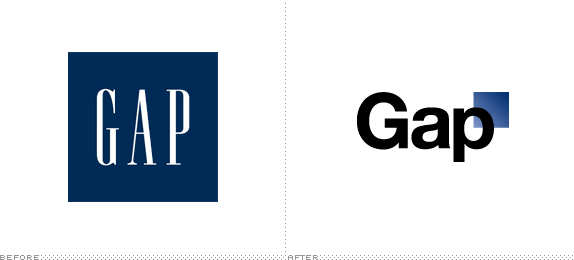
right so, we can all see that this logo is really very poor.
helvetica for one is very overrated and very boring, yeah the old logo was very simple but it seemed to fit 'Gap' well and if we saw the typeface we would all know that it was 'THE GAP' typeface but now.... Helvetica; so many brands use that now a days and it's not original anymore, perhaps thats just my feelings towards it but... they could do so much better plus there are so many facilities that Designers can use, I appreciate that the designer has but a little bit of effort into the new logo but it could look so much better.
What are your views on the new logo?
Source
x

This comment has been removed by the author.
ReplyDelete